Article | Crossing
The Emotional Ecosystem of Colour, Texture and Space
Article | Crossing
The Emotional Ecosystem of Colour, Texture and Space
Article | Crossing
The Emotional Ecosystem of Colour, Texture and Space
How do we perceive space? Materials, colours, and forms define its voice and identity. Their interaction creates a network of sensations that shapes how we experience, move through, and interpret an environment.
April 14, 2026
Within a space, colour is the first element we perceive. It draws the eye and immediately sets the atmosphere, influencing how we feel in that environment.
It is not just decoration, but a fundamental component that builds the emotional identity of a space.
Colour
Colour cannot be considered in isolation. It is always relative. Its perception changes depending on surrounding colours, light, material finishes, and context. This principle is particularly evident in ceramic tile flooring, where material, glaze, and craftsmanship all affect how colour is perceived. A glazed ceramic tile, for example, reflects light differently than a matte surface, altering the depth and intensity of colour throughout the day.
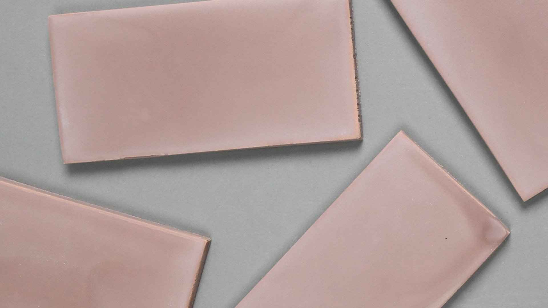
A clear example can be found in handcrafted Italian collections such as Laguna by Relative Floors + Walls. The watercolour-like finish creates soft, shifting variations, making pastel tones dynamic rather than static. The result is a spatial perception that continuously changes with light and context.
Emotional Impact
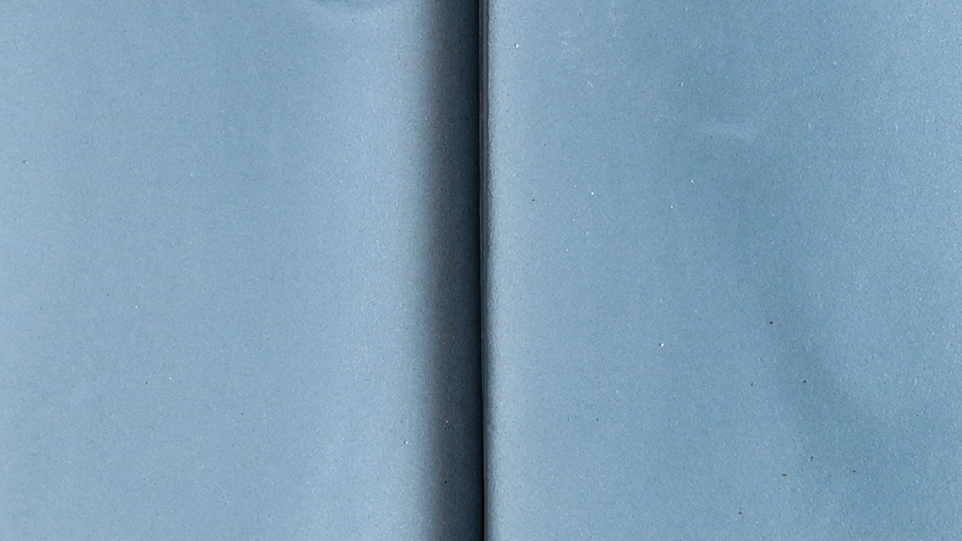
Because colour is relative, its emotional effect also changes depending on the context. A blue tone, such as that found in a glazed ceramic tile inspired by aquatic hues, can feel calm and relaxing in one setting, or cooler and more distant in another. Everything depends on the light, surrounding materials, and colour combinations.
Similarly, a neutral tone, typical of ceramic surfaces, can feel warm and inviting when paired with natural materials, or more sterile and impersonal in uniform, less tactile environments, as seen in the ceramic tile collection Tera - Pumice . For this reason, there are no universally “right” colours. What matters is the relationship between elements.
Terrazzo surfaces, such as those in the Terrazzo collection by Relative Floors + Walls - Spezie, also influence the emotional perception of space. The mix of fragments and aggregates creates a non-uniform surface, made of subtle variations and small contrasts. This makes the colour more dynamic and introduces a sense of depth. When well balanced, this visual richness enhances the space; when overused, it can feel overwhelming. In bathroom environments, for example, ceramic tiles for bathroom are often designed to balance colour and material, creating spaces that feel relaxing but not monotonous.


Texture
If colour defines the atmosphere, texture determines how that atmosphere is experienced. Smooth, reflective surfaces, such as glazed ceramic tile flooring, amplify light and make spaces feel brighter, more open, and clearly defined.
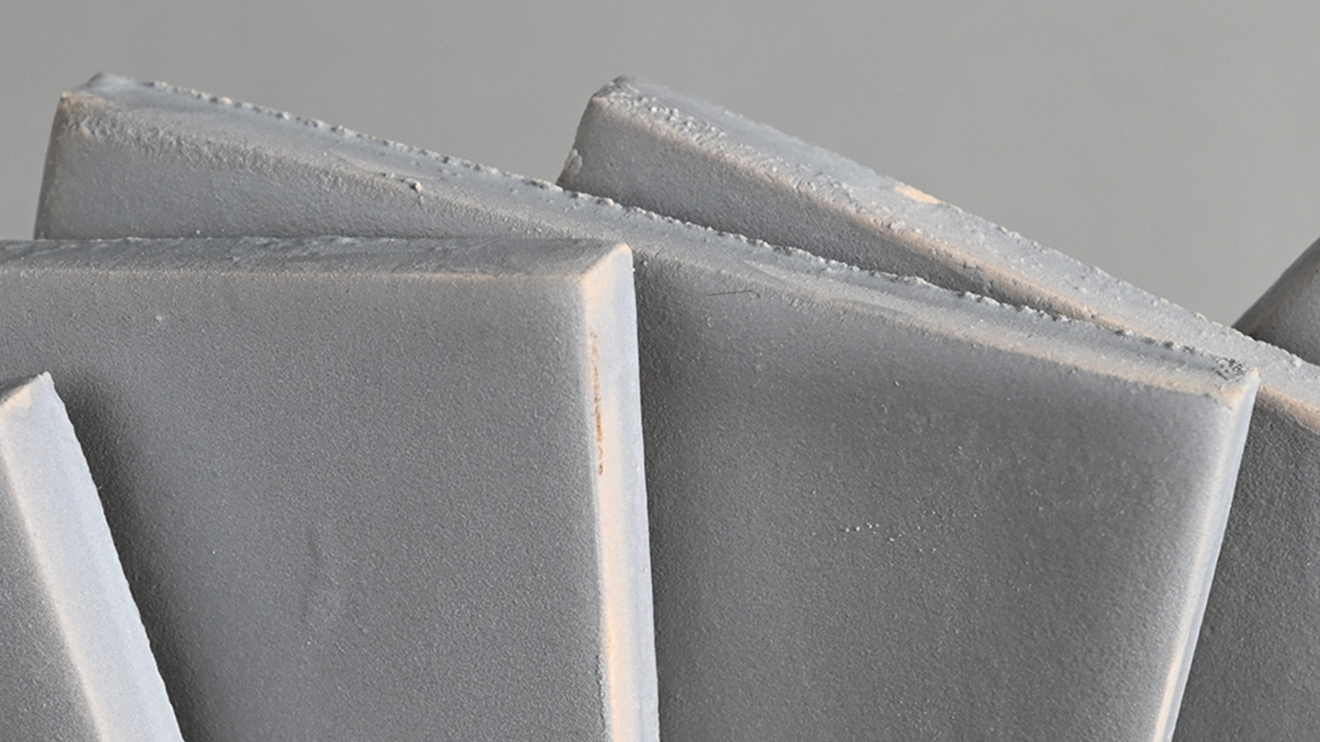
In contrast, more tactile and matte finishes, such as recycled stone tiles from the Pigmento collection, absorb light and create more intimate, warm, and enclosed environments. Texture also influences how we physically relate to a space. A slightly irregular surface draws attention and invites closer interaction, while a uniform surface conveys order, continuity, and a more controlled, detached feeling.
Combination
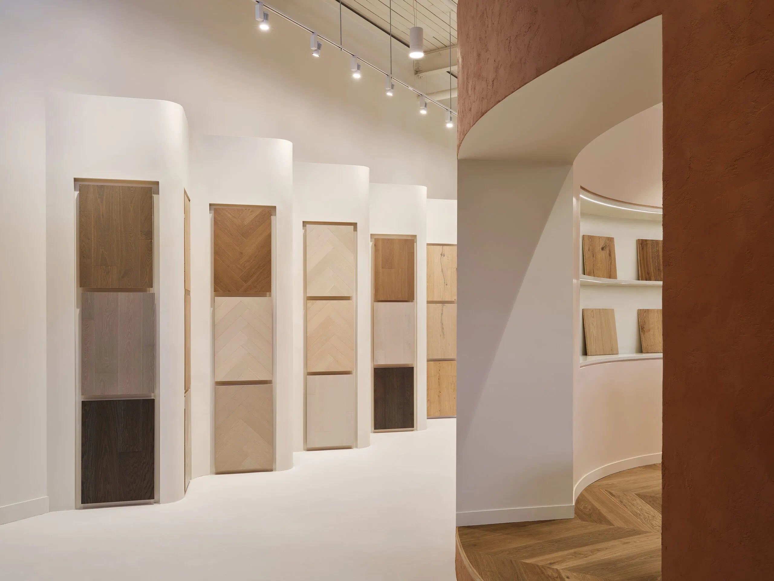
Colour and texture gain meaning through combination. Rarely does a single material define a space; it is the dialogue between surfaces that creates depth. When ceramic tile flooring is combined with materials such as terrazzo, recycled stone, or engineered hardwood flooring, a layered system emerges in which contrasts help define identity.
Pairing warm ceramic surfaces with wood flooring can create a grounded and welcoming atmosphere, while combining cooler tones with polished finishes can enhance a sense of clarity and freshness. The interplay between textured and smooth surfaces helps balance visual depth with clarity. Each combination generates a different emotional perception. It is through these choices that design becomes a tool to shape and guide spatial experience.


Interaction
Colour alone does not create emotion. Emotion emerges from relationships between colours, materials, surfaces, and light. Understanding this allows for a more conscious approach to design. Rather than selecting elements individually, the goal is to build a coherent system in which each component contributes to the whole.
Ceramic surfaces are not just functional elements, but active components in defining the atmosphere. Through even subtle variations in colour and texture, they can significantly alter how a space is perceived. The real question, then, is not only which materials to choose, but how to make them work together.
FAQs
How do tile colours affect mood in interior spaces?
Tile colours influence how a space is perceived and experienced emotionally. Warm tones tend to create comfort and intimacy, while cooler tones can evoke calm or distance, depending on context and material combinations.
Why are tile textures important in interior design?
Textures add a sensory dimension to space. They affect how light is reflected or absorbed and how surfaces are perceived both visually and physically.
Which tile colours are best for relaxing spaces?
Soft, desaturated tones such as light blues, warm neutrals, and natural hues are generally the most suitable. However, the final effect always depends on the balance between materials, light, and context.
Related Posts

What’s the Personality of Your Space?
Spring is a season of renewal, a time when light softens, nature reawakens, and our spaces naturally call for change. In Spring 2026, interior design reflects this transformation through a confi...
Read More
When Colour Becomes Space
We live in an overloaded present, where the immaterial dominates and information turns into constant noise. In this context, objects seem to lose their weight, substance, and sense of truth.
Read More