Article | Crossing
What’s the Personality of Your Space?
Article | Crossing
What’s the Personality of Your Space?
Article | Crossing
What’s the Personality of Your Space?
Spring is a season of renewal, a time when light softens, nature reawakens, and our spaces naturally call for change. In Spring 2026, interior design reflects this transformation through a confident use of color, texture, and personality, moving beyond safe choices toward more expressive and character-driven interiors.
April 14, 2026
Colour plays a central role, bringing energy into our spaces and shaping the way we feel and live within them. This season marks a clear shift, as interior design leaves timidity behind and embraces a richer, more vibrant palette.
Neutral tones are no longer the default, and identity and individuality take their place. If colors have the power to tell our story, why not see them as expressions of personality?
The “Extrovert” Personality
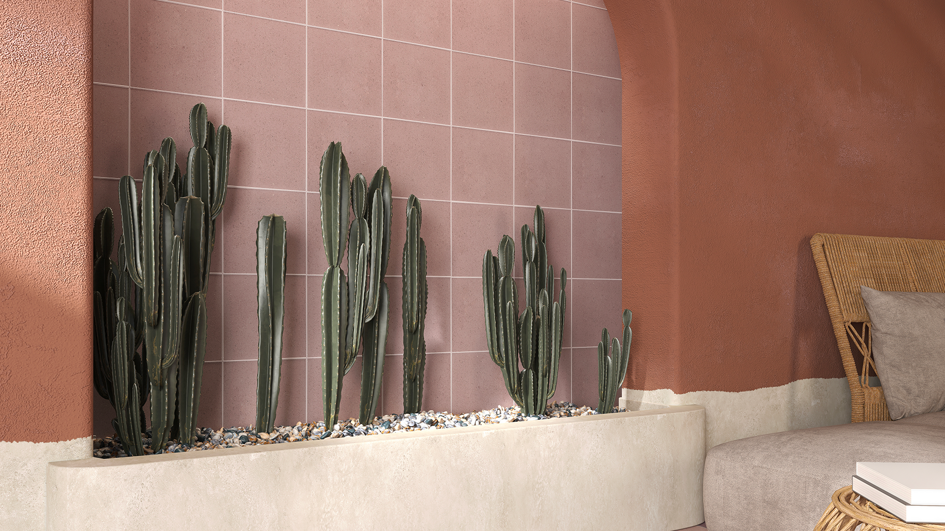
In Spring 2026, neutrals evolve: becoming warmer, richer, more tactile, and deeply natural. These are colors that welcome you in and make you feel at home; warmth becomes an invitation to intimacy, calm, and a slower pace.
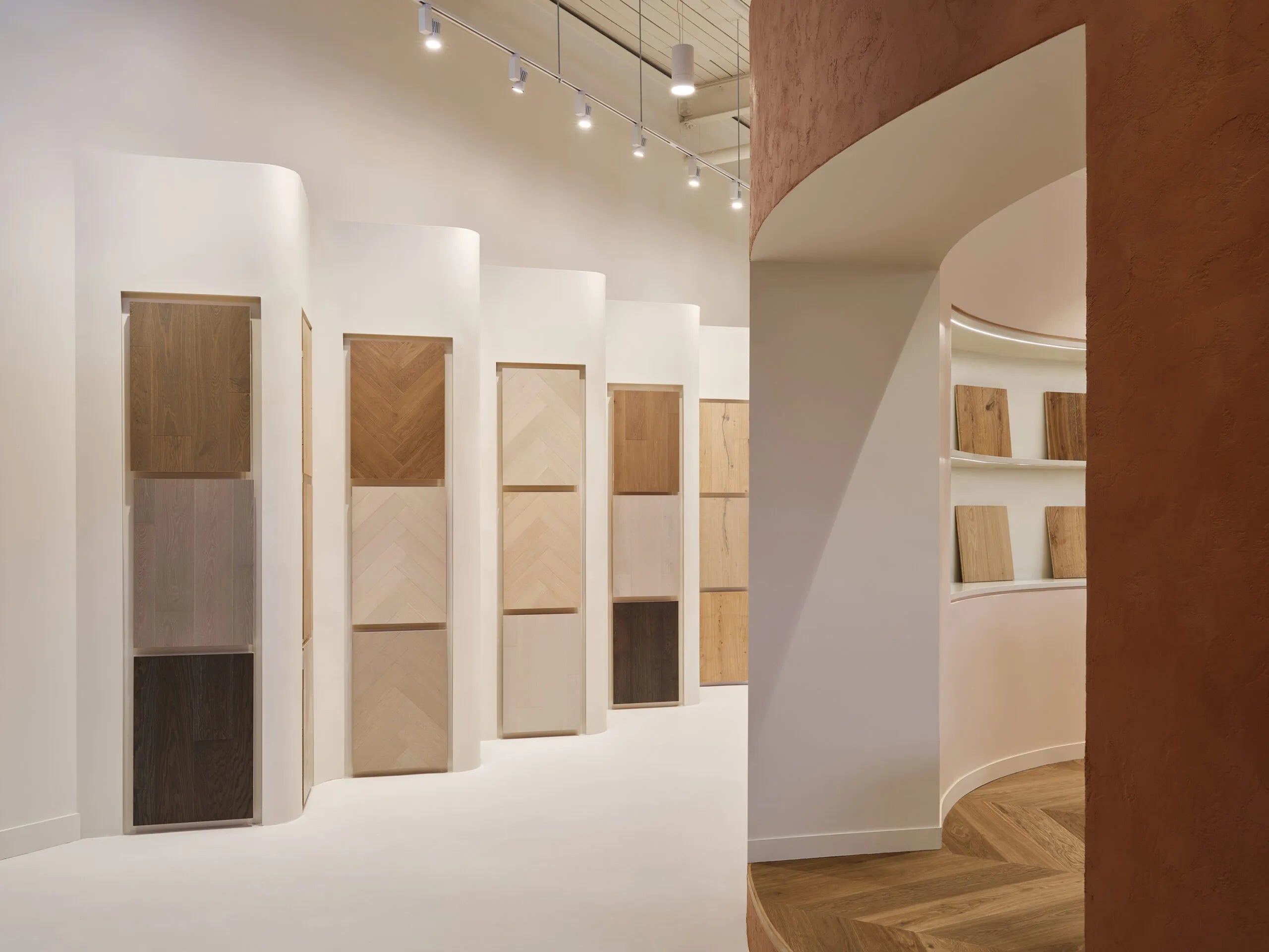
Here we find: browns, rust, chalky pink, smoky blue, tobacco brown, olive, sunbaked terracotta, and soft charcoal. This palette pairs beautifully with ceramic tile flooring and glazed ceramic tile, especially in matte or lightly textured finishes. It’s ideal for ceramic tiles for bathroom spaces, where comfort and relaxation are key, as well as living areas enhanced by engineered wood flooring, hardwood flooring, or engineered timber flooring for a natural, welcoming feel.
It’s a palette reflected in our Ceramic Tile Collection - Tera, with shades ranging from Calce to Ferro, from Jade to Lava, all the way to Pumice.


The “Unpredictable” Personality
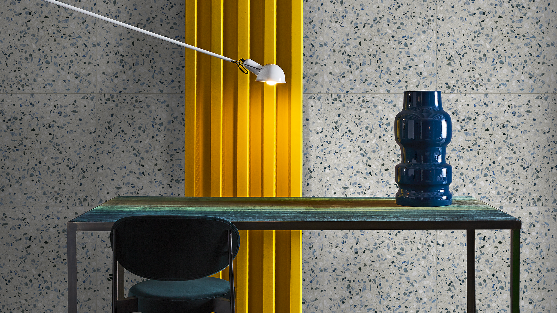
Then there’s the Unpredictable: a personality driven by contrast and the energy of the unexpected. Perhaps the most surprising trend of Spring 2026 is exactly this—the freedom to combine colours that, on paper, shouldn’t work together, yet in reality create lively, dynamic, and truly unique spaces. Among the key tones are teal, cobalt blue, periwinkle, and chartreuse. These shades embrace bold pairings and dynamic compositions.
They work seamlessly with eclectic materials: mixing wood flooring with patterned ceramic tile, or contrasting engineered wood flooring with vibrant glazed ceramic tile accents. It’s a style that celebrates individuality and encourages experimentation.
In our Herringbone Engineered Hardwood Collection - Chico, for example, we love pairings such as Comet & Spice, Terracotta & Charcoal, and Nevada & Chocolate—combinations that reveal the beauty of the unexpected and the character of spaces that dare.


The “Bold” Personality
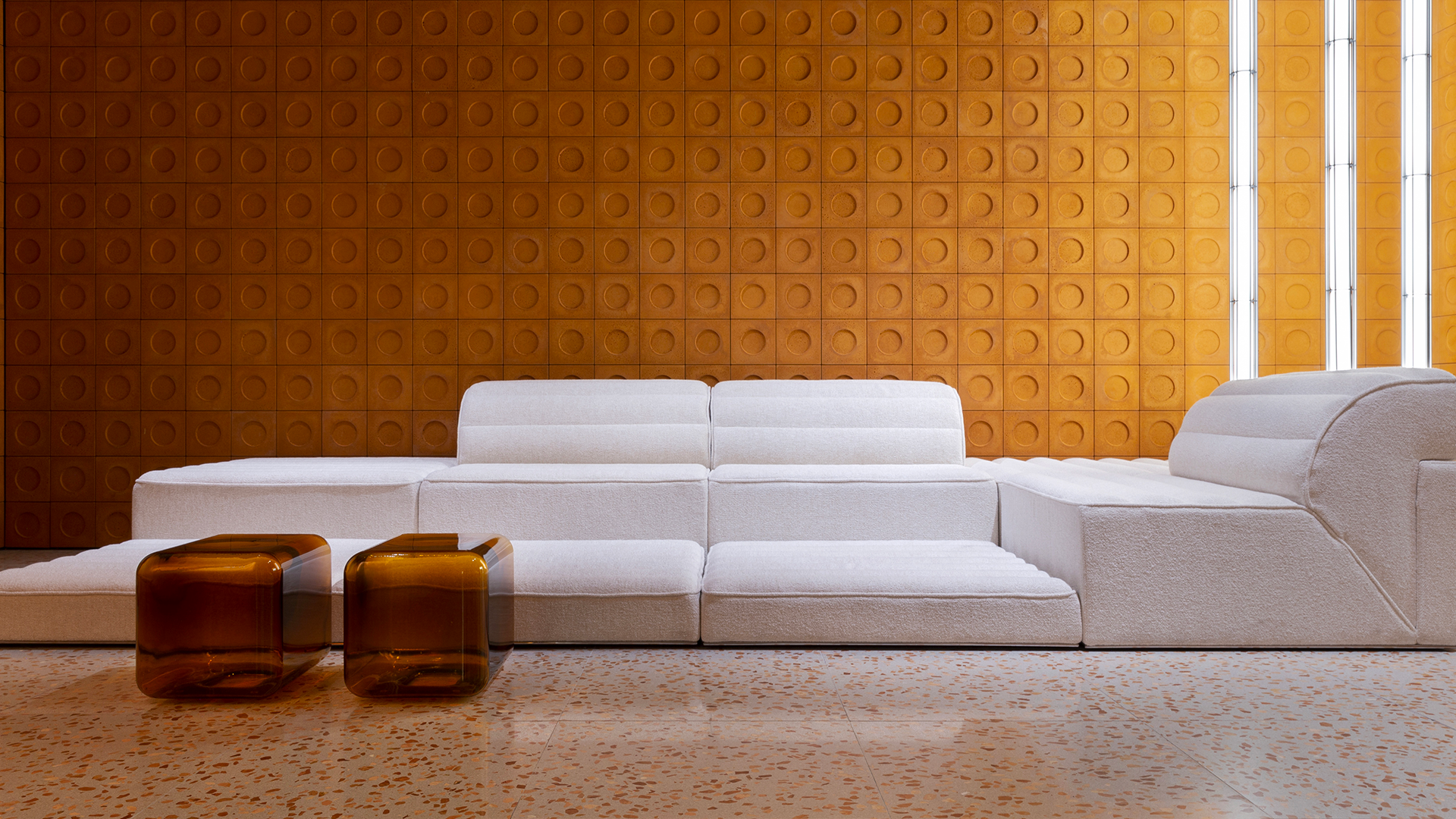
Spring 2026 embraces the depth of jewel tones, opening the door to saturated, intense, and precious colors. Sapphire blue, Prussian blue, softened emerald, mineral greens, cranberry reds: a chromatic symphony that adds character to interiors and transforms each room into a space of expression. The Bold palette is an emotional ecosystem: the deep calm of blues, the introspective spirituality of amethyst, and the harmonious balance of emerald green.
These tones work best with glazed ceramic tile flooring and porcelain ceramic surfaces, especially in polished or glossy finishes that enhance depth and light. Patterned ceramic tile is also perfect for statement walls or floors, paired with refined hardwood floor installation or elegant engineered wood floorboards to balance richness with structure.
This world of colour finds its expression in our Terrazzo collection - Spezie, presented in Cardamom, Cinnamon, Clove, Juniper, Masala, and Sumac.


What’s the personality of your space? Every color is a way of living. Whether you choose the warmth of the Extrovert, the depth of the Bold, or the energy of the Unpredictable, let the tones guide you.
FAQs
What are the key spring colour trends in interior design?
Spring 2026 is defined by expressive palettes: warm natural tones, deep jewel colors, and bold, unexpected combinations. The focus shifts from neutral minimalism to interiors full of personality.
How do tiles reflect spring colour trends?
Tiles play a central role through color, finish, and pattern. From glazed ceramic tile flooring in rich tones to decorative patterned ceramic tile, they bring both color and texture into spaces with versatility and durability.
Which tile finishes work best for spring interiors?
Matte and textured finishes enhance natural, earthy palettes, while glossy and polished porcelain ceramic or glazed ceramic tile surfaces amplify light and depth—perfect for brighter, more vibrant spring interiors.
Related Posts

Building the City for the People Who Live in It
When we imagine cities we’ve never been to, we think of skylines, unique structures of architectural merit or geographic interest—rivers, oceans, hills. However, this distillation of a city prof...
Read More
The Emotional Ecosystem of Colour, Texture and Space
How do we perceive space? Materials, colours, and forms define its voice and identity. Their interaction creates a network of sensations that shapes how we experience, move through, and interpre...
Read More