Article | Refractions
Best Terrazzo Tile Colors for Modern Canadian Interiors

Article | Refractions
Best Terrazzo Tile Colors for Modern Canadian Interiors
Article | Refractions
Best Terrazzo Tile Colors for Modern Canadian Interiors
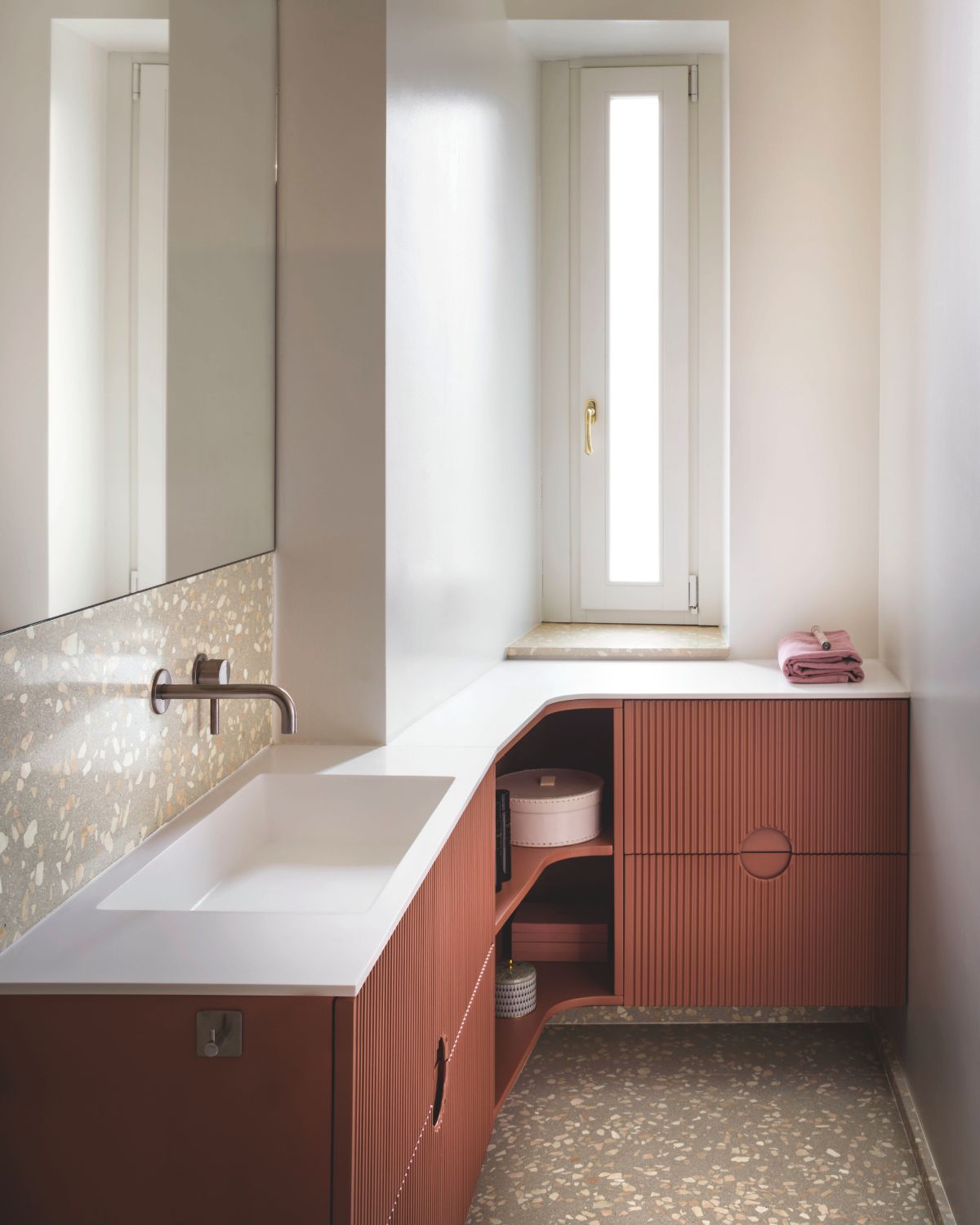
Terrazzo has staged its successful comeback in modern interior designs, uniting the eternal charm of stone with greater versatility and expressiveness. The terrazzo tile is suitable for kitchens, bathrooms, entrance halls, living rooms, and other interior areas for those Canadian homeowners who prefer to add some diversity to their design but do not want their interiors to look too ornate.
August 27, 2026
A color scheme is especially important in terrazzo flooring, since every single shade is in harmony with marble aggregates in the floor. Ranging from neutral shades to warmer colors, the choice of terrazzo color will help create a certain ambiance of the room.
There are six shades available in the Spezie collection by Relative Floors & Walls, inspired by various spices.
Warm Neutrals for Classic Canadian Interiors
Terrazzo in neutral colors is always one of the easiest options for people who wish to have a sophisticated interior that will never look old-fashioned very soon. Warm shades of beige, cream, sand, and grey can help to make an excellent base and let the furniture and other interior elements blend into the interior.
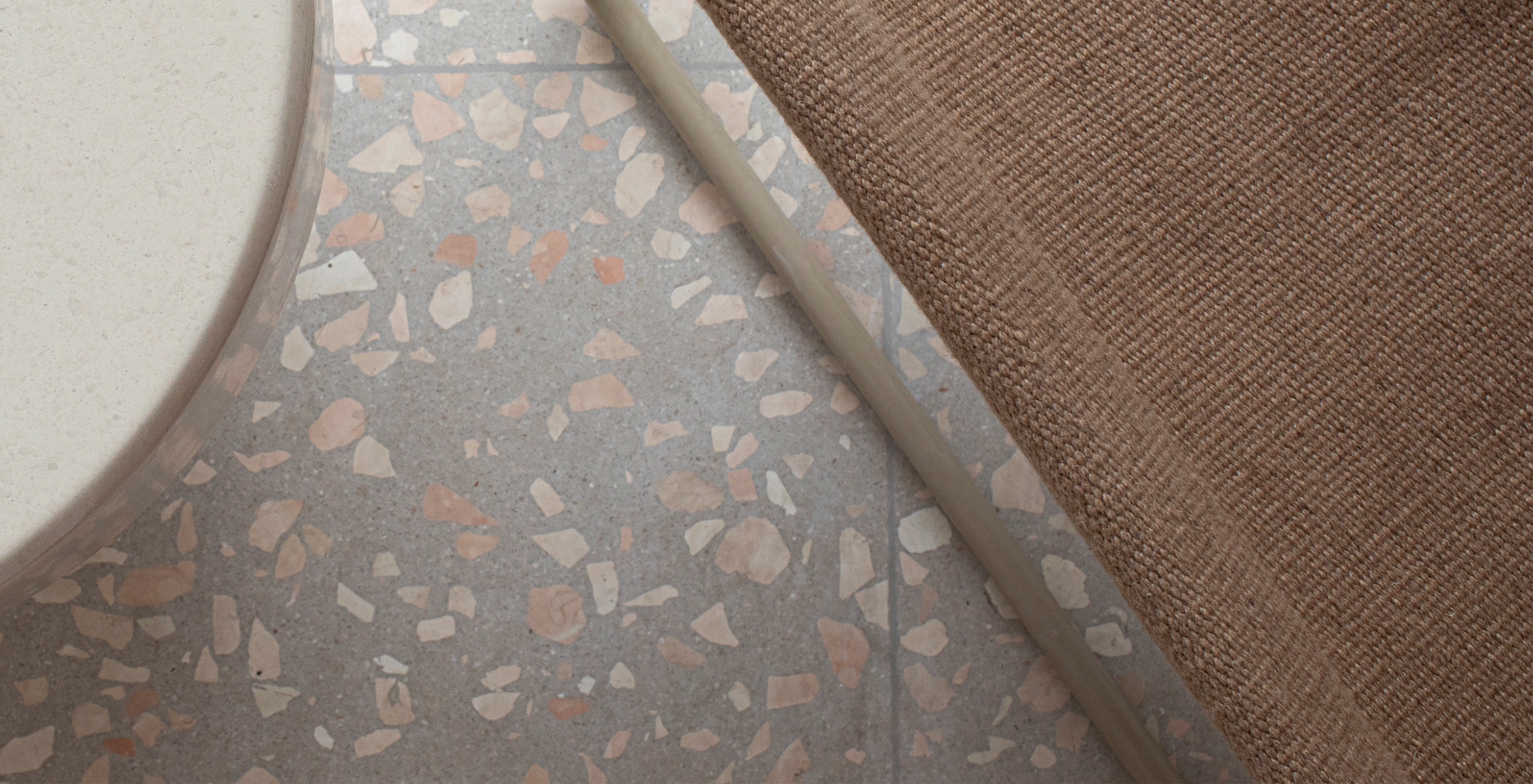
Spezie collection of Relative Floors & Walls is made from neutral terrazzo with marble fragments carefully chosen by experts. Thus, neutral terrazzo has enough individuality to be interesting to look at.
For Canadian interiors, neutral terrazzo in warm colors can look amazing together with natural wood, off-white walls, warm metals, and minimalist furniture.
Terrazzo Colors to Add Warmth to Your Palette
When a neutral palette appears too plain, earthy terrazzo colours can bring warmth while remaining elegant. Terrazzo colours such as brown, green, beige, and more natural accents will make large interior spaces feel grounded and welcoming.
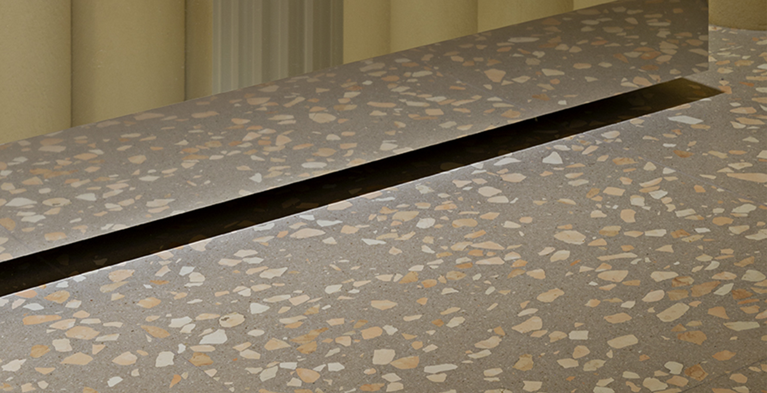
The colour palette of the Spezie collection is inspired by spices, and its colours include Cardamom, Cinnamon, Clove, Juniper, Masala, and Sumac. The range of colours from this palette varies from lighter greens and beige shades to browns and earthy accents. These terrazzo colours can be great for open-plan interior spaces because of their flooring capabilities.


Which Terrazzo Color is Suitable for Small Spaces?
Lighter terrazzo colors are usually better suited for small rooms, since they will help keep the place brighter and more spacious. A light background with a slight color variance will create the necessary texture and character, but won’t make the space cluttered visually.
The use of large terrazzo tiles will also enhance the look by minimizing the number of visible grout joints. But it is always essential to take into account the natural and artificial lighting, the proportions of the room, the cabinetry, walls, and other factors. For small bathrooms, entrance halls, and kitchens, light tones of Spezie are a great choice.
Contrasting Darker Terrazzo Color Schemes
Dark or intense terrazzo colors could help make your design stand out even further. Instead of including these darker terrazzo colors throughout smaller rooms, you might want to include them in bigger spaces or for use on the floor.
Dark terrazzo flooring will complement light-colored walls, wood furniture, cabinets, and fixtures. You get to add contrast into your interior design without letting the flooring consume the entire design. If you have something more in mind, you could also choose color schemes like Juniper, Masala, and Sumac from the Spezie collection.
Can Terrazzo Tiles Be Used on Floors and Walls?
Yes, this will depend on the product at hand. Relative Floors & Walls' Spezie Terrazzo range of tiles is used in interior floors and interior walls, with some examples of application being high-traffic floors, bathrooms, kitchens, and feature areas. These products are also suitable for use in shower walls and floors.
This gives homeowners the flexibility to use terrazzo colors on various surfaces or mix other materials for contrast. This can be achieved by using terrazzo flooring combined with basic ceramic tiles on walls to achieve balance and modern design in bathrooms.


Interaction
Colour alone does not create emotion. Emotion emerges from relationships between colours, materials, surfaces, and light. Understanding this allows for a more conscious approach to design. Rather than selecting elements individually, the goal is to build a coherent system in which each component contributes to the whole.
Ceramic surfaces are not just functional elements, but active components in defining the atmosphere. Through even subtle variations in colour and texture, they can significantly alter how a space is perceived. The real question, then, is not only which materials to choose, but how to make them work together.
FAQs
How do tile colours affect mood in interior spaces?
Tile colours influence how a space is perceived and experienced emotionally. Warm tones tend to create comfort and intimacy, while cooler tones can evoke calm or distance, depending on context and material combinations.
Why are tile textures important in interior design?
Textures add a sensory dimension to space. They affect how light is reflected or absorbed and how surfaces are perceived both visually and physically.
Which tile colours are best for relaxing spaces?
Soft, desaturated tones such as light blues, warm neutrals, and natural hues are generally the most suitable. However, the final effect always depends on the balance between materials, light, and context.